
After just five seasons in the American League, the Abbotsford Heat ceased to be following a 5-3 loss to Grand Rapids in Michigan on May 2nd, 2014.
The first-round series defat to the Griffins in the first round of the play-offs spoilt a potential fairytale ending after recording a franchise-high 43 wins in the regular season.
Calgary shifted their affiliate from British Columbia to Adirondack, leaving fans in Abbotsford without professional hockey.
That was until the Vancouver Canucks opted to move their affiliate in Utica, New York to BC.
It seemed inevitable for the longest time with NHL owners trending toward have American Hockey League affiliates closer to home.
That it happened was somewhat of a shock at the time with the Utica Comets having one of the strongest fan bases in the league and continuing to be an extremely competitive team in their partnership with Vancouver.
The announcement for the new team name, logo and team colours was delayed for a few days.
On Wednesday, July 14, 2021, we finally found out what months of planning had resulted in for Abbotsford.
The Abbotsford Canucks.
Highly unoriginal and disappointingly so.
My firm belief for a long time is that an AHL club requires its own identity to connect with the local community and fans.
Abbotsford is the seventh AHL team to share its name with its NHL parent club, following the Bridgeport Islanders (New York), Belleville Senators (Ottawa), Iowa Wild (Minnesota), Providence Bruins (Boston), Texas Stars (Dallas) and Wilkes-Barre/Scranton Penguins (Pittsburgh).
The club’s logo is Johnny Canuck.
Johnny Canuck was the primary logo used by the Western Hockey League’s Vancouver Canucks, a franchise in existence from 1945 until Vancouver entered the NHL in 1970.
The Vancouver Canucks bought the rights to the Johnny Canuck logo more than a decade ago, but have used it sporadically to this point, including using the head on the third jersey and perhaps always had this in mind.
This logo has divided opinions online.
Personally I am not a fan.

It is a little too cartoonish for my liking, akin to something a junior team may opt to go with or perhaps a specialty/third jersey for an AHL/ECHL team.
I adore the the logos designed for new ECHL franchises in Quebec and Iowa this year, and the effort by Abbotsford pales in comparison.
The Canucks colours are described as “Field green, Pacific blue, Fraser Blue, valley fog grey and mountain white, representing the area that the Abbotsford Canucks will proudly play for.”
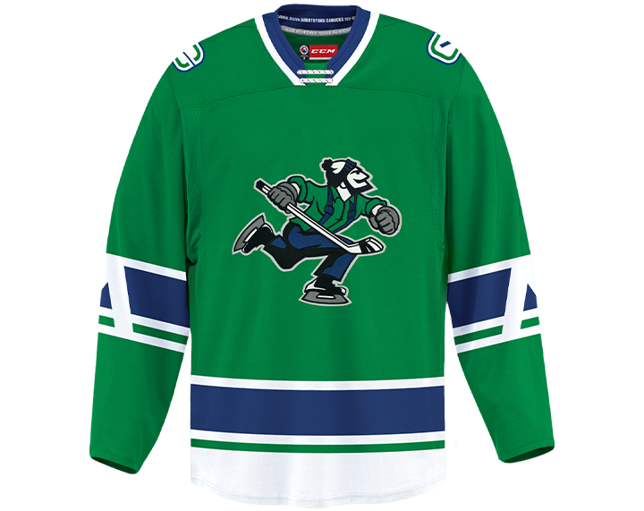
The primary dark sweater is green, while the secondary sweater is white.
This colour scheme is something I can get behind and I particularly like the letter ‘A’ for Abbotsford incorporated into the sleeve.
Abbotsford Canucks G.M. Ryan Johnson
Abbotsford will begin play in 2021-22 and shall compete in the Pacific Division.
